How to design a winning poster

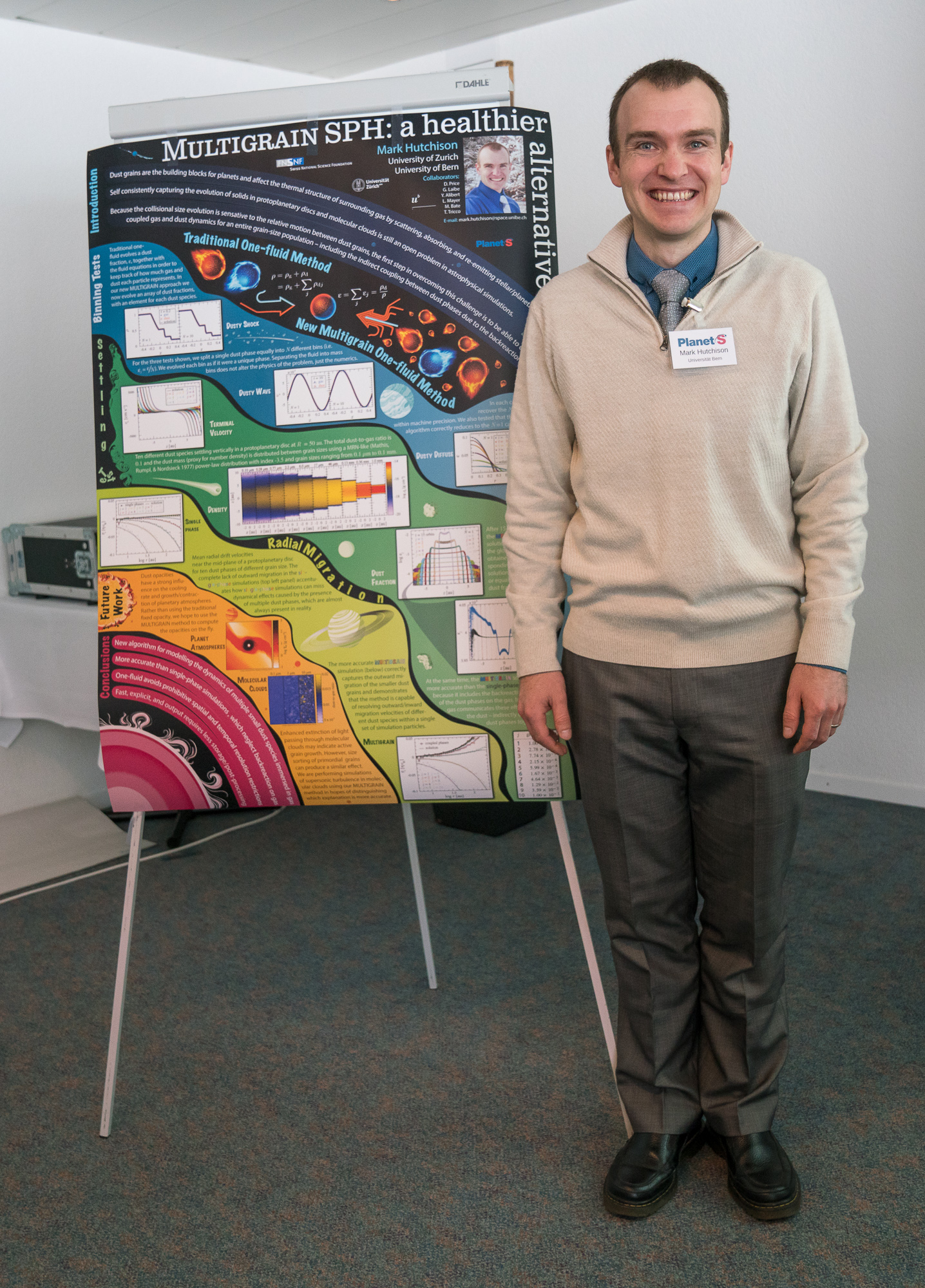
Postdoc Mark Hutchison with his winning poster. (Photo Sylviane Blum)
With his colourful work Mark Hutchison, postdoc at the University of Bern, won the prize of the best poster presented at the PlanetS General Assembly 2018. Here, he tells us what it takes to make a good poster.
By Mark Hutchison
The first international conference I attended was a Division of Plasma Physics meeting in the US with over 2000 participants. Walking through the sea of posters, trying to find my allocated slot, I felt like my poster had just rolled out of a factory cake mould – along with the hundreds of other posters on display. While I am sure hundreds looked at my poster, read my title, and perhaps even read some of the fine print, I suspect it slipped quietly from their memory by the time the reached the end of the row.
I learned two important lessons from that meeting. First, those that made attractive looking posters always had more visitors. More importantly, even though I could not always recall the details of their study, I could recall their faces when I passed them in the crowd or saw them later at other conferences. Secondly, posters are hard to read. They are not journal articles and they should not be made to read like one. There are distractions everywhere: (i) it is noisy, crowded, and you are usually holding a drink and/or finger food; (ii) when you find a poster that looks interesting, you find yourself doing acrobatics to find a clear line of sight that lasts longer than a few seconds (perks of being short); and (iii) once you manage to worm your way to the front where you can finish reading the introduction, the person next to you starts asking the author about the conclusions and you immediately stop reading to listen.
It takes time for good ideas to mature and even longer to figure out how to draw them on paper. I usually start brainstorming for poster concepts at least one month before the conference. After I have settled on a design, I usually dedicate 3–4 days to convert that design into something tangible. Finally, I make sure to leave myself about a week before the poster needs to be printed so that I can continue to tweak the poster as needed.
This is especially important for those of us who do not consider themselves artistic. In my initial planning stages, I spend an hour or two just trolling the web for pictures that I find visually appealing (hint: I tend to find the most inspiration from non-science posters). The content is completely irrelevant. What I look for in these images is a colour scheme (because the intricacies of choosing my own colour scheme elude me) and a concept for presentation/organisation (because I have a hard time looking at a blank page). A good colour scheme consists of 5 colours or less, while a good concept, generally, is composed of simple shapes and a flat background. However, exceptions abound so use your good judgement.
At the risk of offending some readers – LaTeX makes beautiful papers, but ugly posters. Even Powerpoint and Keynote are a significant improvement because they allow you to manipulate objects and rearrange your space on the fly. They also carry the benefit that they are easy to use. However, the possibilities really start opening up when you start using vector graphics software, such as Adobe Illustrator or InDesign (I use a combination of Illustrator and Photoshop). Vector graphics are great because they are scalable to any resolution and they are easily manipulated. Some of my favourite tools are: pen, twirl, warp, image trace, stamp, magic eraser, paint bucket, symbol sprayer, patterns, masking/cutout images with arbitrary shapes, line text, area text, 3D image rendering, and mapping textures/images onto surfaces. Furthermore, you can lock/hide images while you work on others.
Note, that this is different to asking someone, “how does it look?” People will only truly open up if they know that you are looking for critical feedback and that you will not be offended. When possible, try to find someone with a background in design because they will be able to give you practical advice on what you can do to improve your design. However, good feedback can come from anyone. In today’s society, we are bombarded with images of every kind and people do not need to know the theory behind the image to discern what is and is not appealing to the eye.