Wie man hübsche Illustrationen von Exoplaneten kreiert

Von Thibaut Roger
Wer jemals einen Presseartikel über Exoplaneten gelesen hat, ist bestimmt auch auf eine hübsche, künstlerische Darstellung als Illustration gestossen. Ausser in seltenen Fällen können wir Exoplaneten tatsächlich nicht direkt sehen, wir messen nur ihre Wirkung auf den jeweiligen Mutterstern. Selbst bei der Methode der direkten Bildgebung sehen wir nur einen Lichtpunkt . Das ist weit von dem entfernt, was Illustrationen zeigen, auf denen man manchmal die Atmosphäre, das Land, die Ozeane oder sogar das Klima erkennen kann. In diesem Artikel stelle ich einen einfachen Weg vor, wie sich solche visuellen Darstellungen realisieren lassen, nachdem ich deren Ziel und Regeln besprochen habe.
Künstlerische Darstellung – wie und warum?
Illustrationen haben verschiedene Ziele:
1) Sie erleichtern das Verständnis. Dank ihnen können wir abstrakte Begriffe konkretisieren, wodurch die Wissenschaft für Laien besser verständlich wird. Mit Hilfe einer visuellen Darstellung kann das Gehirn die reale Bedeutung leichter erfassen, indem es Analogien zu dem macht, was es bereits weiss. Dabei spielt die Popkultur und deren Repräsentation von Planeten eine wichtige Rolle, da sie die bisherigen Erfahrungen des Gehirns prägen kann und damit die Analogien, die es mit ähnlichen oder unterschiedlichen, visuellen Darstellungen in Zukunft machen wird.
2) Sie können helfen, bestimmte Exoplaneten zu identifizieren. Dies gilt für die breite Öffentlichkeit, aber auch für Astronomen und Spezialisten. Wenn ich den Namen GJ436b nenne, werden mir nicht viele Leute sagen können, was das Besondere an diesem Planeten ist, ausser man ist ein Experte auf diesem Gebiet. Doch wenn ich das folgende Bild zeige…
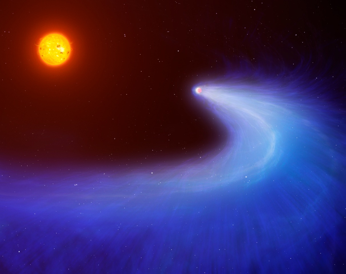
Planet GJ 436b, künstlerische Darstellung. (Illustration: Mark Garlick/University of Warwick)
Ooooh, plötzlich ist es klarer. Wenn Sie diese Illustration bereits gesehen haben, werden Sie sich wahrscheinlich daran erinnern, was diesen Planeten so besonders macht, und Sie können vielleicht auch zusätzliche Informationen abrufen. Man könnte argumentieren, dass diese Darstellung auch für andere Planeten, die ebenfalls verdampfen, zutreffen kann, zum Beispiel für Kelt-9b. Das ist wahr und falsch zugleich. Für die meisten Exoplaneten, die so interessant sind, dass ihre Entdeckung mit einer Pressemitteilung angekündigt wurde, gibt es auch eine eigene (oder gar mehrere) künstlerische Darstellungen. So wird Kelt-9b häufiger durch das folgende Bild dargestellt.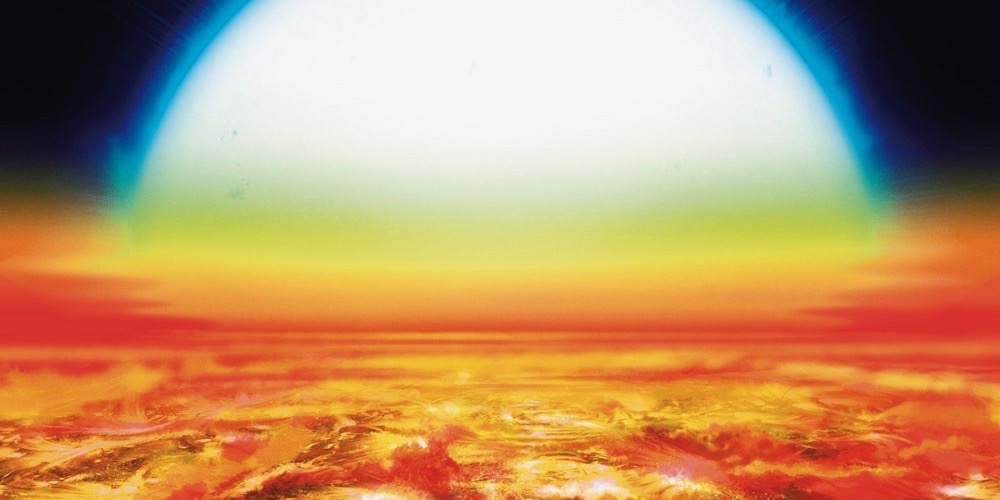
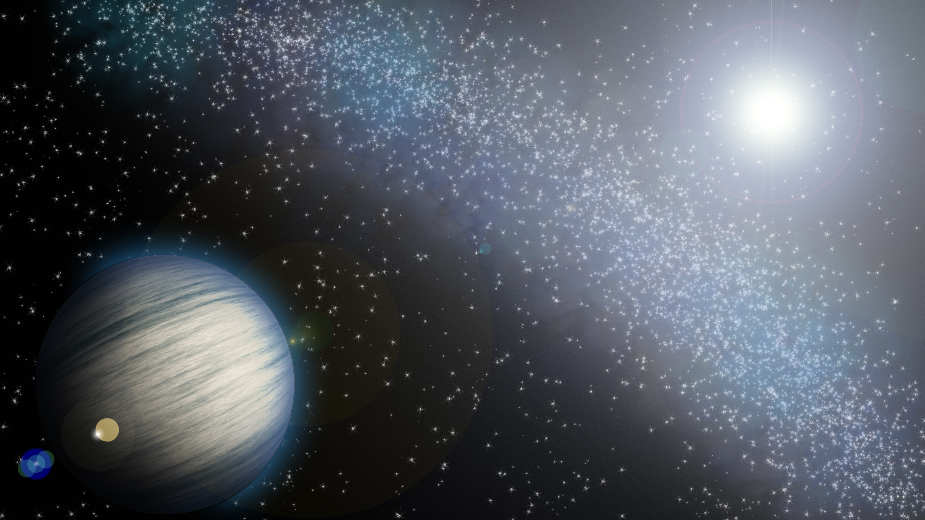
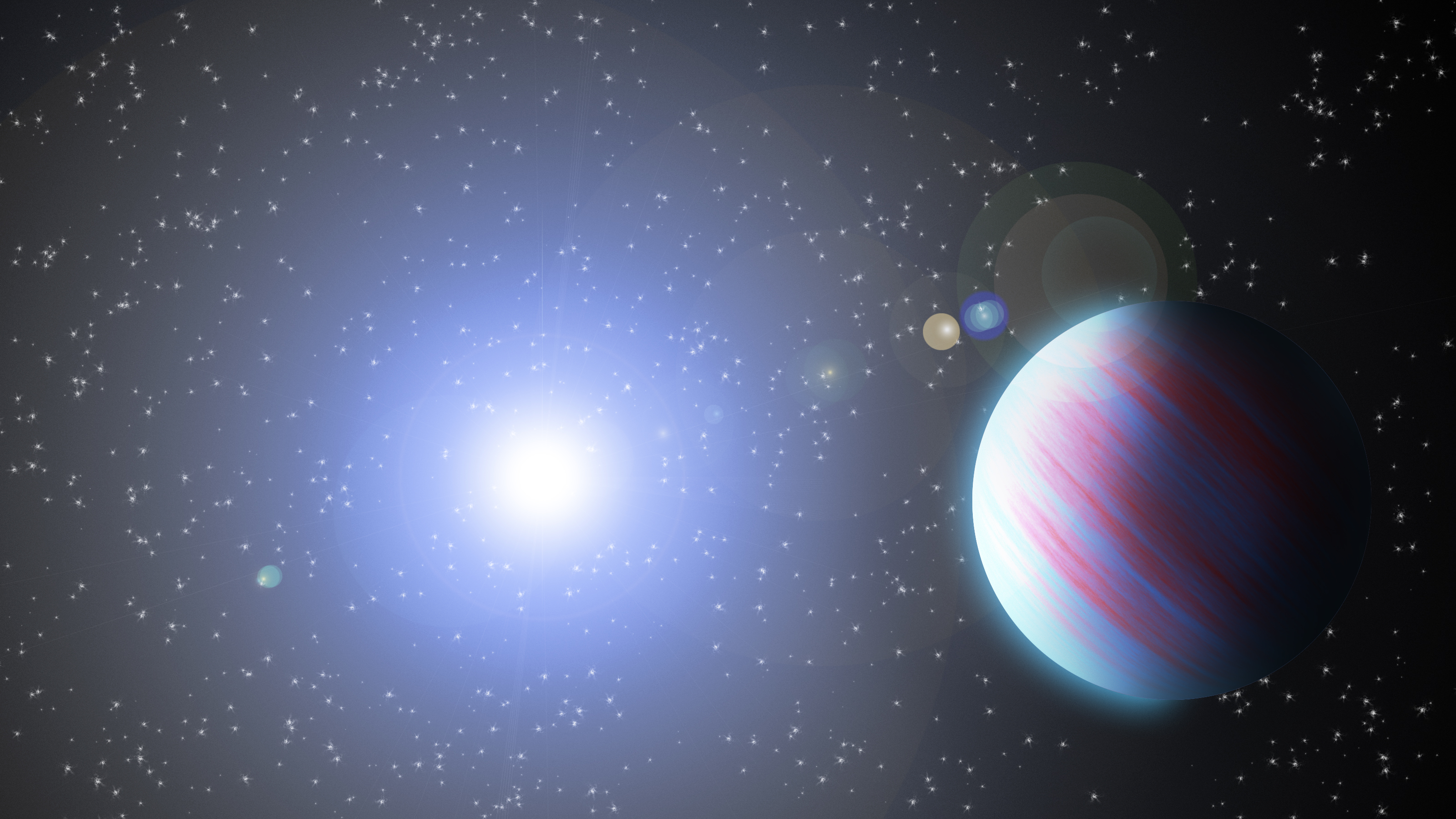
3) Sie enthalten Informationen zusätzlich zum Exoplaneten-Namen. Tatsächlich ist die Illustration nicht zufällig gestaltet oder sollte es zumindest nicht sein. Hier folgen zwei leicht unterschiedliche Beispiele eines Exoplaneten, von dem ich später zeigen werde, wie die Darstellung entstanden ist.
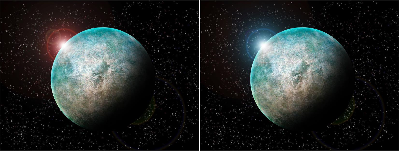
Es gibt tatsächlich keinen grossen Unterschied, „nur“ die Farbe des Sterns ist anders. Doch diese kleine Änderung enthält viele Informationen. Angenommen der Mutterstern ist ein sogenannter Hauptreihenstern: Weil der Stern auf dem linken Bild rot ist, kann ich sagen, dass es ein M-Zwerg ist, ein kleiner und kalter Stern, der hauptsächlich im roten Teil des Spektrums Licht aussendet. Auf der rechten Seite hingegen handelt es sich entweder um einen O- oder B-Stern, ein sehr massereicher, grosser, heller und heisser Stern. Handelt es sich auf beiden Seiten um den gleichen Exoplaneten, so bedeutet dies, dass er auf der rechten Seite viel weiter entfernt von seinem Stern sein muss als auf der linken Seite. Wird im Artikel zur Illustration die Grösse des Exoplaneten angegeben – nehmen wir zum Beispiel die Grösse der Erde – so kann man sogar die Entfernung grob abschätzen, indem man die Grössen von Planet und Stern vergleicht. So lässt sich auch die Oberflächentemperatur schätzen.
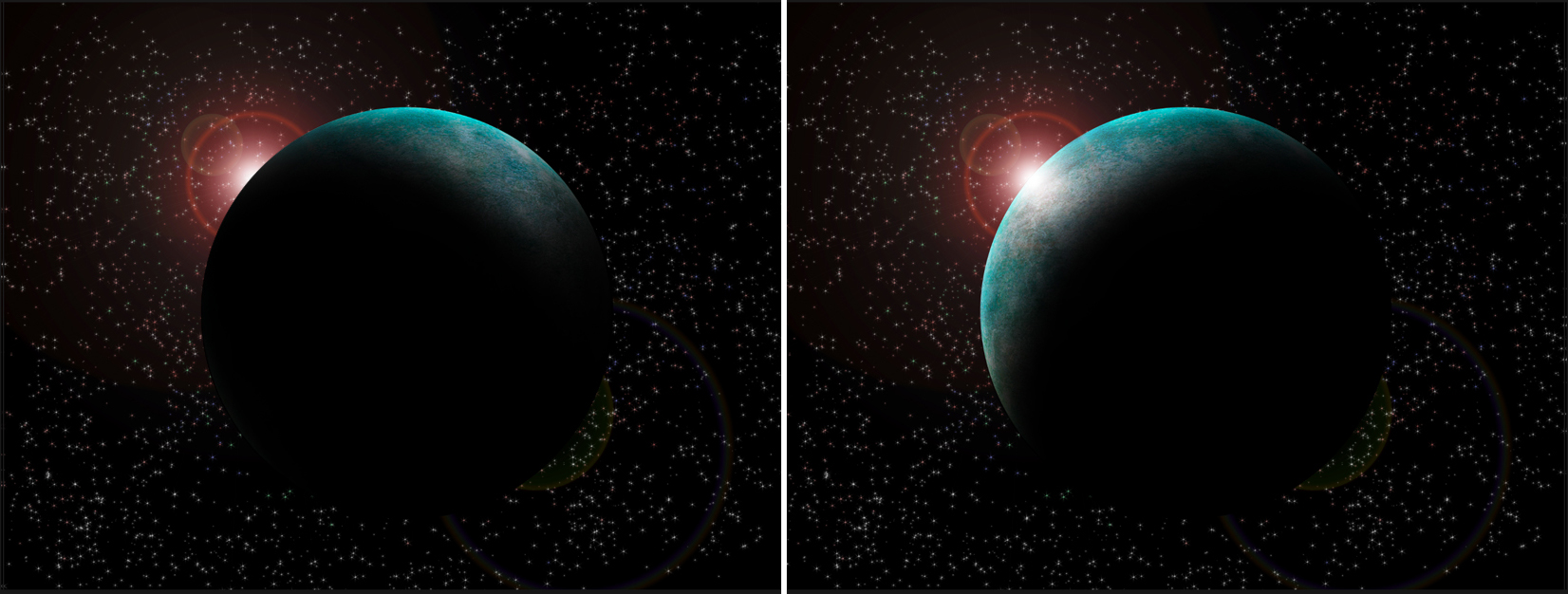
4) Sie regen die Phantasie und damit das Interesse der Öffentlichkeit an – was zu einem Widerspruch mit meiner vorherigen Aussage führen kann. Um eine emotionale Reaktion des Betrachters auszulösen, muss sich eine künstlerische Darstellung manchmal von einigen realen Aspekten befreien. Betrachten wir nochmals das obige Beispiel: Angesichts der Position des Sterns ist der Schatten nicht korrekt, und noch weniger auf der linken Seite unten. In Tat und Wahrheit sollte der Schatten eher wie auf dem rechten Bild unten dargestellt werden. Meiner Meinung nach ist das Bild darüber jedoch künstlerisch interessanter. Es hat mehr Ausdruck und bringt mehr Emotionen mich sich als das Bild unten rechts (als Einzelbild).
Schliesslich muss man bei der Erstellung einer Illustration abwägen zwischen den Kenntnissen, die man darstellen will, und einigen künstlerischen Freiheiten, die man sich leisten möchte, um ein interessanteres und attraktiveres Ergebnis zu erzielen. Da wir normalerweise relativ wenig Informationen über die von uns dargestellten Exoplaneten haben, können wir uns diese Freiheiten dort nehmen, wo es sich um Unbekanntes handelt. Zum Beispiel hätte ich mich entscheiden können, in meiner Darstellung die Oberfläche mit Einschlagkratern zu übersäen, oder in der Mitte mit einem Ozean zu füllen, oder in der Nähe der Nachtseite einen riesigen Sturm zu zeigen… Da wir diese Informationen nicht haben, wäre nichts falsch, da alles möglich sein könnte.
Tutorial: So entsteht ein Planet
Nachdem wir gesehen haben, was visuelle Darstellungen sind und was dabei wichtig ist, können Sie jetzt selbst ans Werk gehen! Dazu benötigen Sie eine Bildbearbeitungssoftware. Ich werde Ihnen zeigen, wie man das mit der Adobe Creative Suite (in diesem Fall Photoshop) macht, aber das Prinzip bleibt das gleiche bei anderen Programmen wie GIMP, einer kostenlosen Alternative. Bitte beachten Sie, dass die angegebenen Tastenkombinationen für Photoshop auf Mac und Windows gelten und folgen Sie den Anweisungen auf Englisch.
- Open a new document (cmd+N or ctrl+N) with the size you want. I tend to favour a 4/3 or 16/9 landscape format personally.
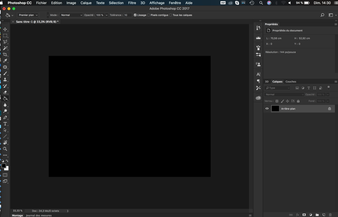
- Paint the background in black for the base.
- We will now create our background, full of stars. One solution is to copy and paste directly the picture of a field of view full of stars. A quick search on internet will provide you with many pictures. Alternatively, we can paint our background. Haowevers , obtaining a proper realistic star field would deserve its own tutorial, I will only show you a basic method. For that:
- Create a new layer (cmd+shift+N or ctrl+shift+N) or this symbol
 under the layer interface.
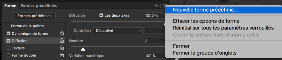
 - Select the white colour and the paint brush, we will have to play with the brush to get the effect we want, go in brush properties.
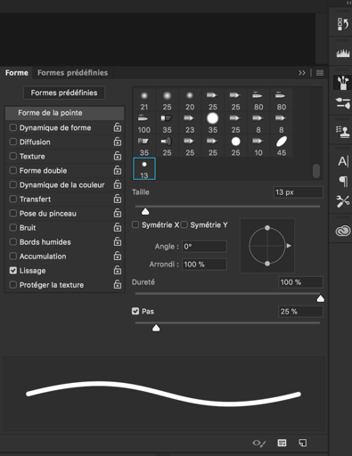
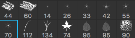
- In “shape of the brush“ (forme de la pointe) select a brush looking like a star. In this exemple, the ones with numbers 14, 26, 33, 42, 55 and 70 under them.
- Increase the step (pas) until the preview of the brush is not a single line anymore.
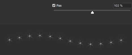
- Select “Shape dynamics” (Dynamique de forme) and increase the size variation (variation de taille) to 100%, this will create random sized stars.
- Select “Diffusion” and in it, select “both axes“ (les deux axes). Increase the diffusion to spread the points. Increase “number” to get more stars and increase “Numerical variation” (variation numérique) to get random variation of the spatial concentration and thus look more realistic. The preview of the brush should now look like that, instead of a single line:
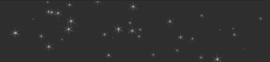
- Test the brush and play with the various parameters (size of the brush, step, size variation, etc.) until you are satisfied. Note that you can save your brush parameters to avoid doing that part again in the future.
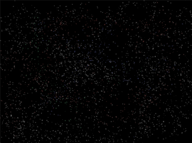
- You can now fill the void space with stars. You can eventually play with light colours to add red/blue shifted stars, and concentrate stars in some parts to make some clusters, galaxies or a Milky Way effect.
- Create a new layer (cmd+shift+N or ctrl+shift+N) or this symbol
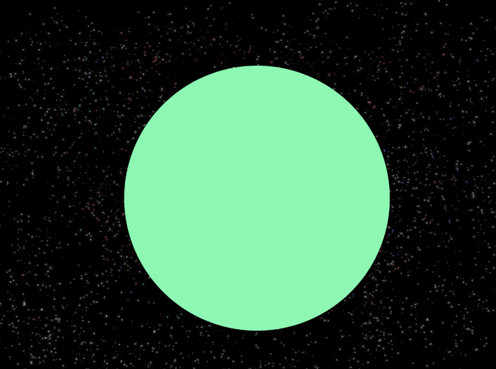
- Create a new layer and use the circular selection tool to create a circle (hold shift while tracing to stay circular). This will be the base shape for our planet. Fill the circle with some colour (doesn’t matter which).
- Now will be the most decisive step in the creation of our exoplanet and you may need to try a few times before to be satisfied (but with experience you’ll need less tries). We will prepare the topography or our planet and some of it’s surface features. Best strategy depends the type of planet you want: rocky, gaseous, etc.
- For gaseous planets…
- Create a new layer (cmd+shift+N or ctrl+shift+N)
- Select two colours slightly different for foreground and background, they will be the base colours of our gaseous planet. Here I selected colours similar to Jupiter and Saturn.

- Go in the menu to „Filters“ -> „Render“ -> „Fibres“. I advice a low variance and intensity. You can use the random button to generate a different render. This will fill the layer with some alternation of our two selected colours. You should obtain a texture like the following.
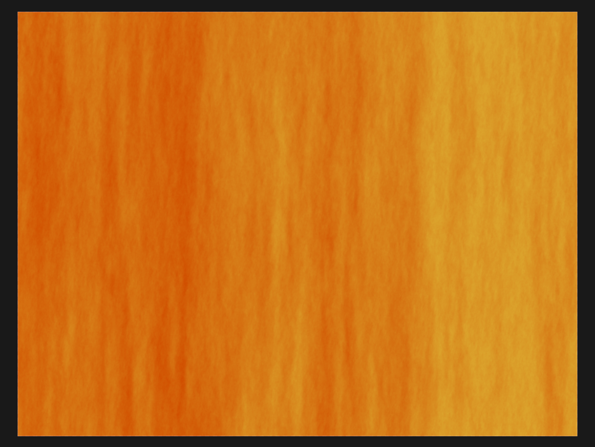
- For rocky planets, you will need a texture picture of very good quality, either found online or taken by yourself with a good camera. What work usually the best is to use something natural, like ice, mud or even concrete. Rust, dirty places and more generally textures containing some colour variations are the more interesting. Once you have selected one, copy and paste it in photoshop.
- For gaseous planets…
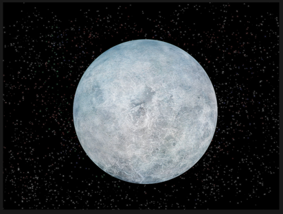
- Resize and rotate your texture (cmd+T or ctrl+T) so it fills at least all of the circle for our planet (it can be bigger). The rotation enables you to positions some surface elements where you want for rocky planets and determine the axis of rotation of your gaseous planet (the rotation axis will be perpendicular to the stripes). So it is important you already think to the position of your host star to get a rough idea where the shadows will be.
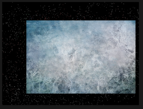
- Select the planet circle of step 4 (cmd/ctrl + click on the layer containing it). And then click on the texture layer to make it the active one.
- Go to “Filter” -> “Distort” -> “Spherize”

- Apply it with 100%, and the area selected will get rounder. This step helps give a bit more volume.
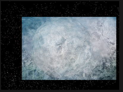
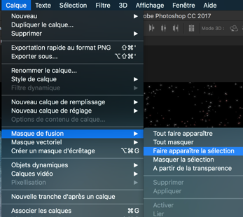
- Go to “Layer“ (Calque) -> Layer mask -> „Reveal selection“ (Faire apparaître la sélection). This will make invisible all that is not in the circle.
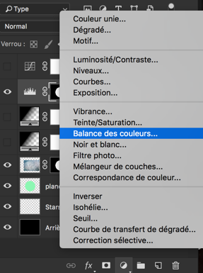
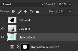
- Below the layer list, you can use the following icon to add layers to play with the colours of the planets. You have many possibilities here. Just select the planet shape before so they apply only to the planet and not the background. Those steps are not mandatory and are just to adapt your exoplanets to your taste/will.
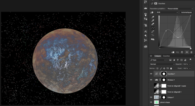
- Example of „levels“ (niveaux) : change the contrast.
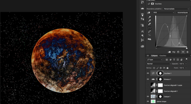
- Examples of „curve“ (courbe).

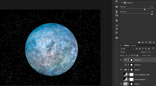
- Example of „vibrance“.
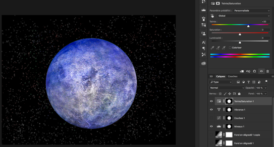
- Example of „hue/saturation“ (teinte/saturation). Easiest way to change colours but might not be best looking, you can apply on all colours at the same time or only specific ones.
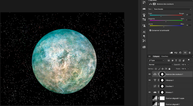
- Example of „colour balance“ : by playing on light, dark and mediums, you can get nice results for differentiate various zones of the planet.
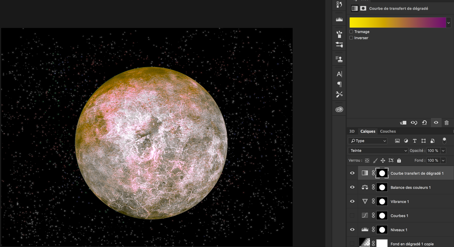
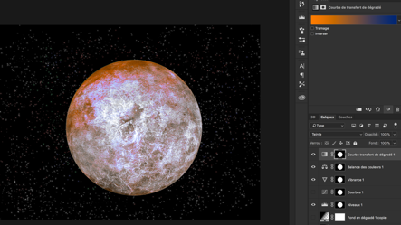
- Example of “gradient map” (courbe de transfert de dégradés), more complicated to use, you also need to change the mode of the layer at the same time (“Hue” here) I would recommend only if you are experienced.
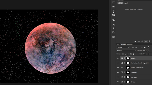
- Example of „invert“ (négatif). Can be useful depending on your starting layer.
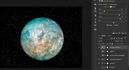
- Example of “selective colour” This one is really nice as you can play on each colour separately, I was able to reinforce a bit the brownish colour this way in our example.
- Example of „levels“ (niveaux) : change the contrast.
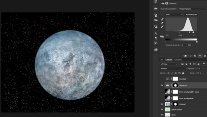
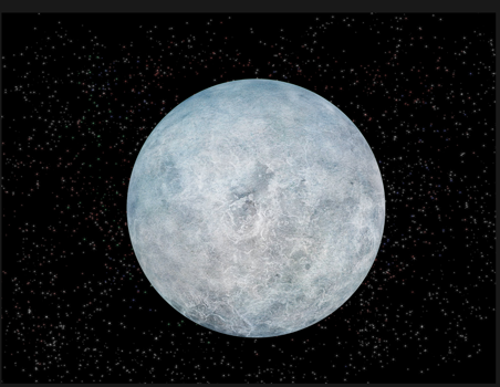
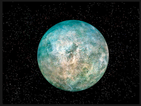
- In the end, I selected in this example only my “levels”, “vibrance” and “colour balance” layers to get the colour I wanted. Comparison before/after all three layers.
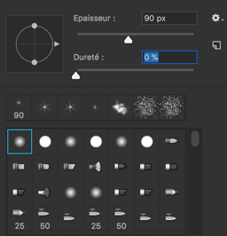
- Create a new layer (cmd+shift+N or ctrl+shift+N), and select black colour + the following brush:
- Select the planet shape like in step 7. We will now do the shadow on the planet, do it accordingly to the position intended for your light source. You can eventually do that in multiple layers and play with the opacity of some shadow layers to reveal a bit more the surface and make the planet more appealing.
- Put the shape layer on top of all the others, except the shadow one(s). And put its “fill content” (fond) to 0%. The difference with opacity is that the effect we will now add will still appear, while they would not if opacity was at 0%.
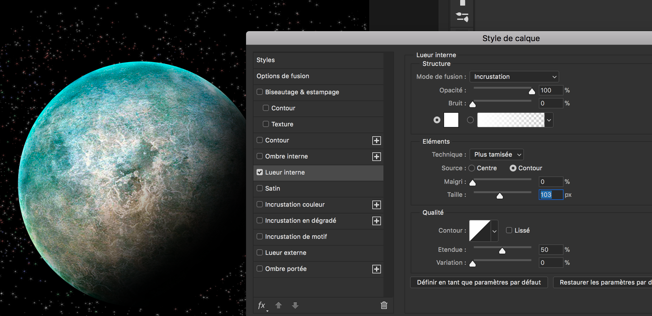
- We will now add so lighter tones on the day side to get a better spherical aspect. Double click on the shape layer and add a “inner glow” (lueur interne). Set it to “overlay” (incrustation) instead of normal, and select the white plain colour, plus play with „size“ to get what you prefer.
- For gaseous planets, or if you want to add an atmosphere glow for the rocky ones, you can duplicate the previous layer and changer the inner glow effect back to normal mode, and select a colour (vary the opacity and size to obtain the best). In addition you will need an outer glow effect of the same colour. The best looking option regarding the colour is to chose one dominating on the planet.
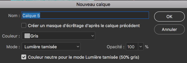
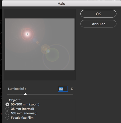
- Finally we will add a parent star (this is a very easy way to do, with the drawback it must be further away than the planet. More complicated ways with other render would need a proper tutorial). Create a new layer (cmd+shift+N or ctrl+shift+N) and select colour grey, mode “ hard light” (lumière crue) and select the box “neutral colour for the hard light mode (50% grey).
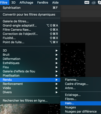
- Go to Filters, Render -> Lens Flare (halo).
- Move the source to match the planet side for example or the position you want, and select the type of lens flare you like the most, and you have your star! It might take a couple of try to adjust the position if not good the first time when clicking ok. If so, just cancel (cmd+Z or ctrl+Z) and redo it.
Congratulations, you have created a very nice looking exoplanet!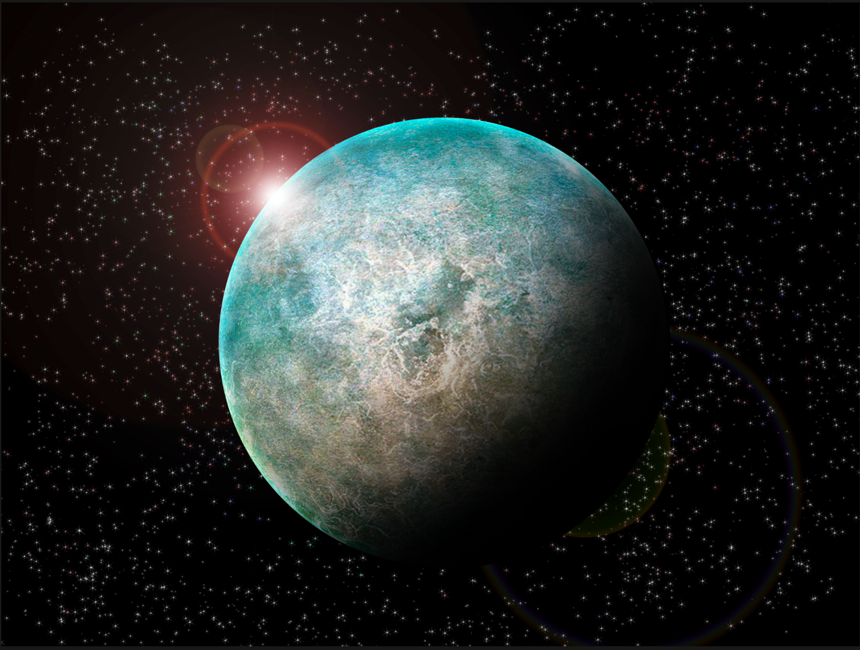
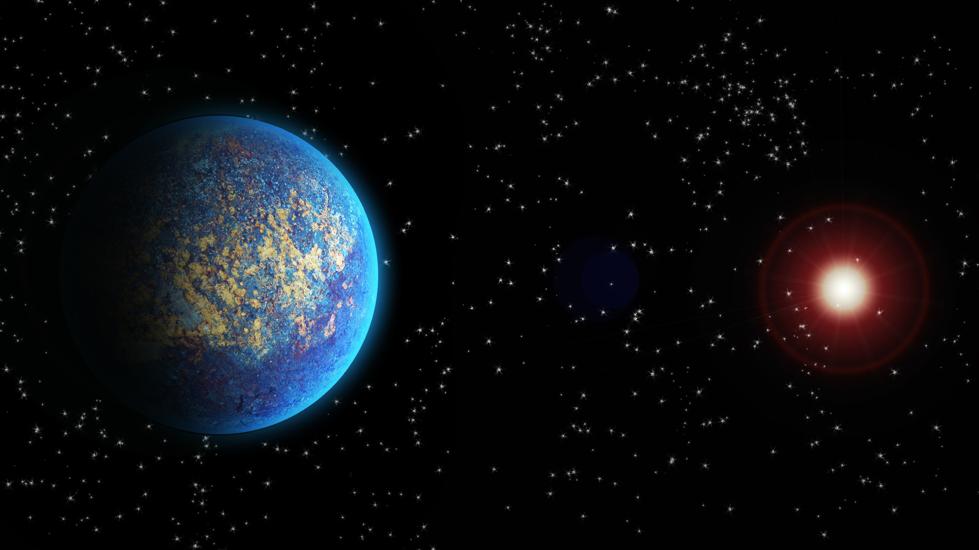
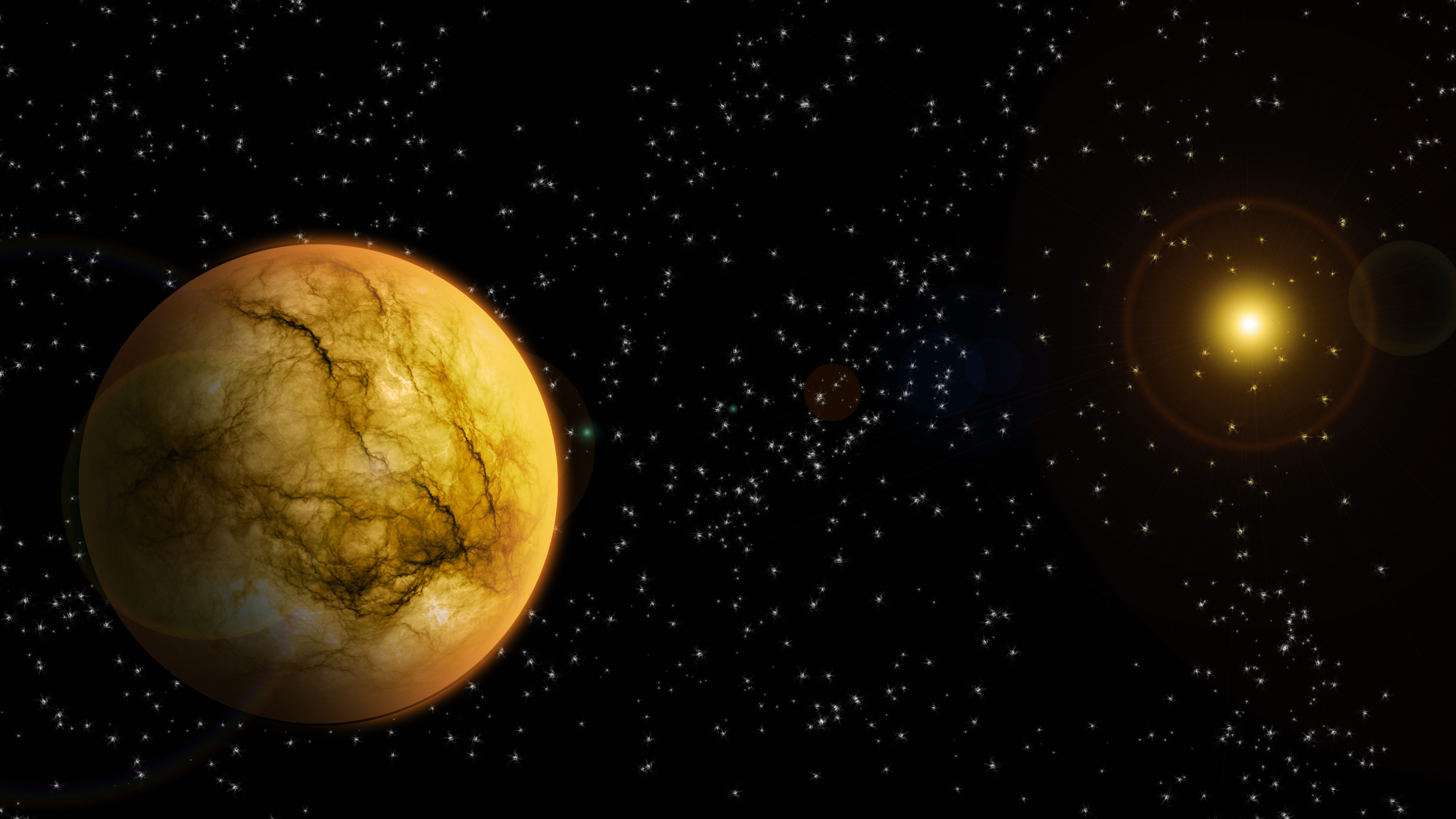
Now, this should give you the base necessary to make your own exoplanets, you can experiment and try variations of this tutorial to obtain some results a bit different. To finish, here is a gallery of few others made that way. If you try this tutorial, don’t hesitate to share your results with us on Facebook!
Categories: External Newsletter