Tutorial: How to make nice and simple exoplanets artist’s impressions

By Thibaut Roger
If you have ever read a press article about exoplanets, you certainly have already seen a nice artist’s impression illustrating it. Indeed, except for rare cases, we cannot see an exoplanet directly, we only see its effect on its host star. Even when we can use the method called direct imaging to see an exoplanet, all we see is a dot of light on a picture, far from what illustrates articles where you can see the atmosphere, the land, the oceans or even the climate sometimes. In this article, I will present you an easy way to create such artist’s renderings, after discussing their goal and rules.
Artist’s impression… what and why ?
Artist’s impressions are serving multiple purposes:
1) They ease the understanding. Indeed, thanks to them, we can make some abstract notions more concrete for the public, thus making Science easier to understand for the non-initiated public. With the help of a visual representation, the brain can grab more easily the physical meaning, by making analogy with what it already knows. Therefore, the pop culture (movies, anime comics, etc.) and the representation of planets in it, are playing an important role as they can define some of the previous experiences from the brain and thus influences the analogies the brain will make in the future with similar or different artist’s impression.
2) They can help identify specific exoplanets, this is valid for the general public but also with peer astronomers and specialists. If I give you the name GJ436b, how many people can tell me what is the specificity of this planet ? For sure not many… except if you are an expert of the domain of course. Yet, if I show you the following picture…
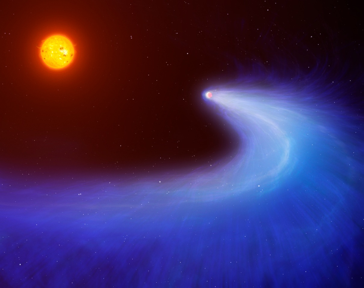
Planet GJ 436b, artist’s impression. (credits: Mark Garlick/University of Warwick)
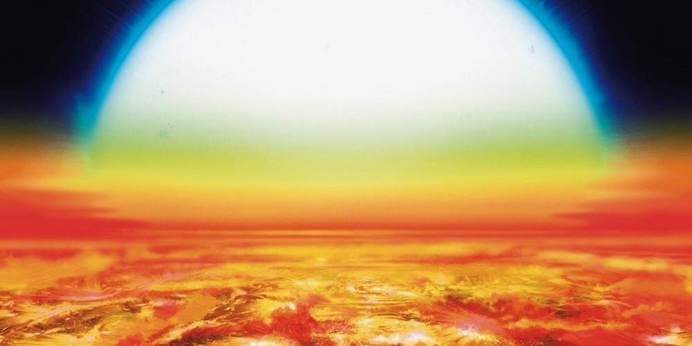
Ooooh, suddenly it is more clear. If you have already seen this illustration (and even maybe if you have not), you will probably remember what made this planet so specific and some additional information about it. You might argue that this illustration could stay valid for other planets also evaporating, like Kelt-9b. This is true and false at the same time. As a matter of fact, most of the time, specific exoplanets that have proven interesting to remember and thus to get a press release for their discovery, have each their own artist’s impression (even multiple ones sometimes). As such, Kelt-9b would be more often represented by the following picture for example.
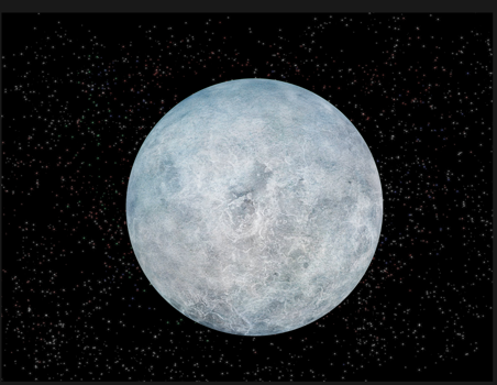
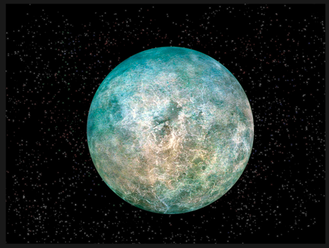
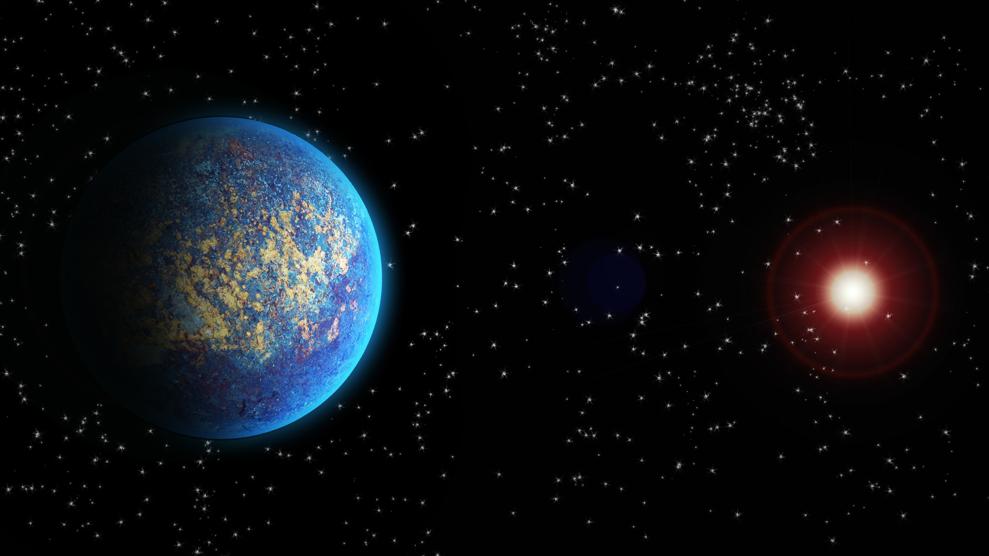
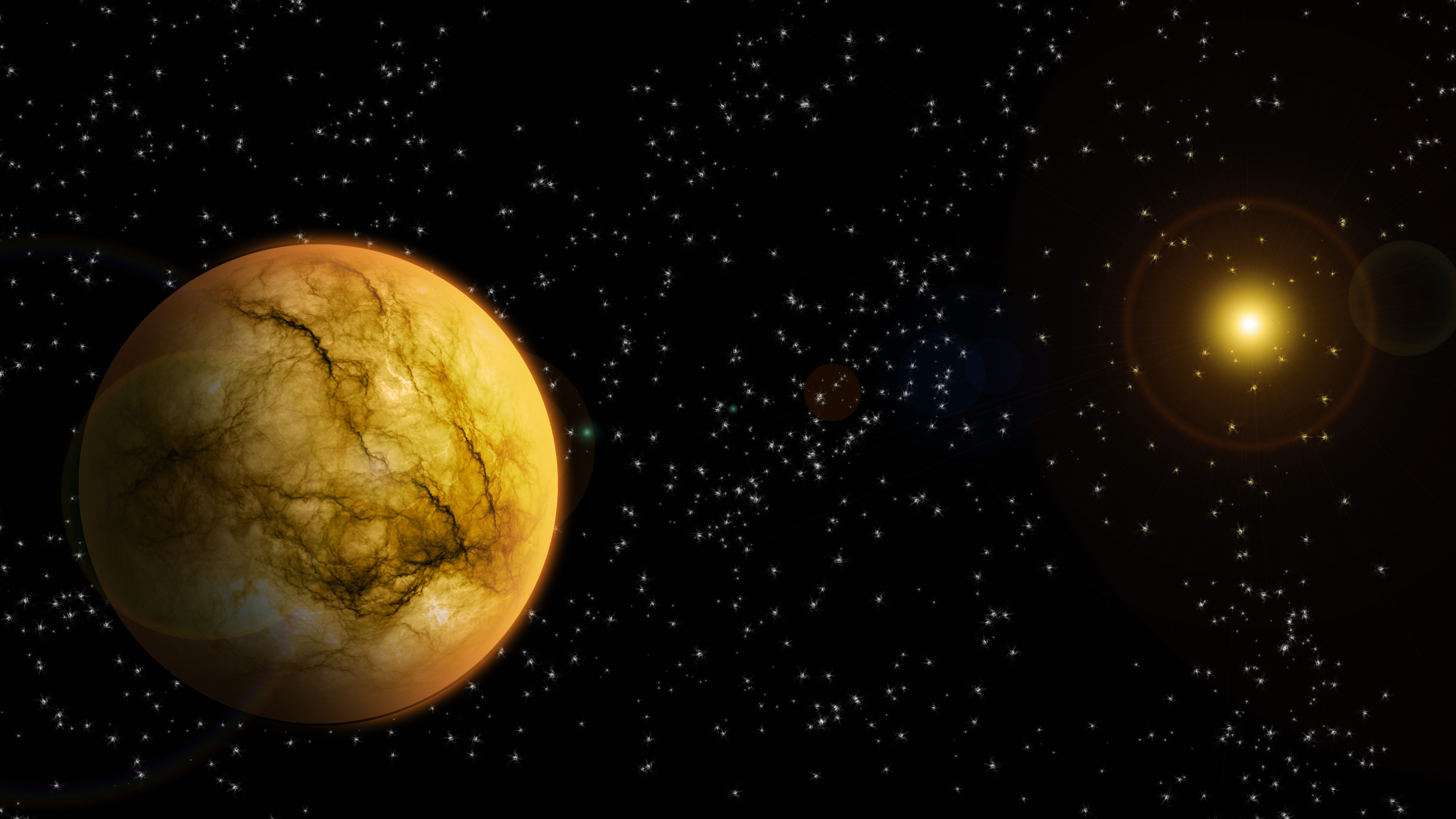
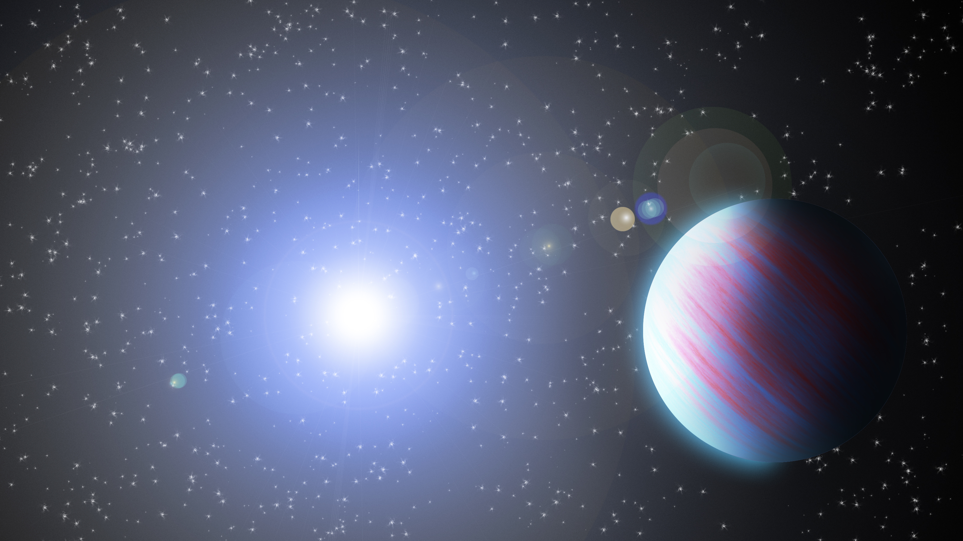
3) They carry information, other than its name. In fact, an artist’s impression is not, or at least should not be, designed randomly. I will take the following two slightly different examples, which is the exoplanet I will show you how to create after.
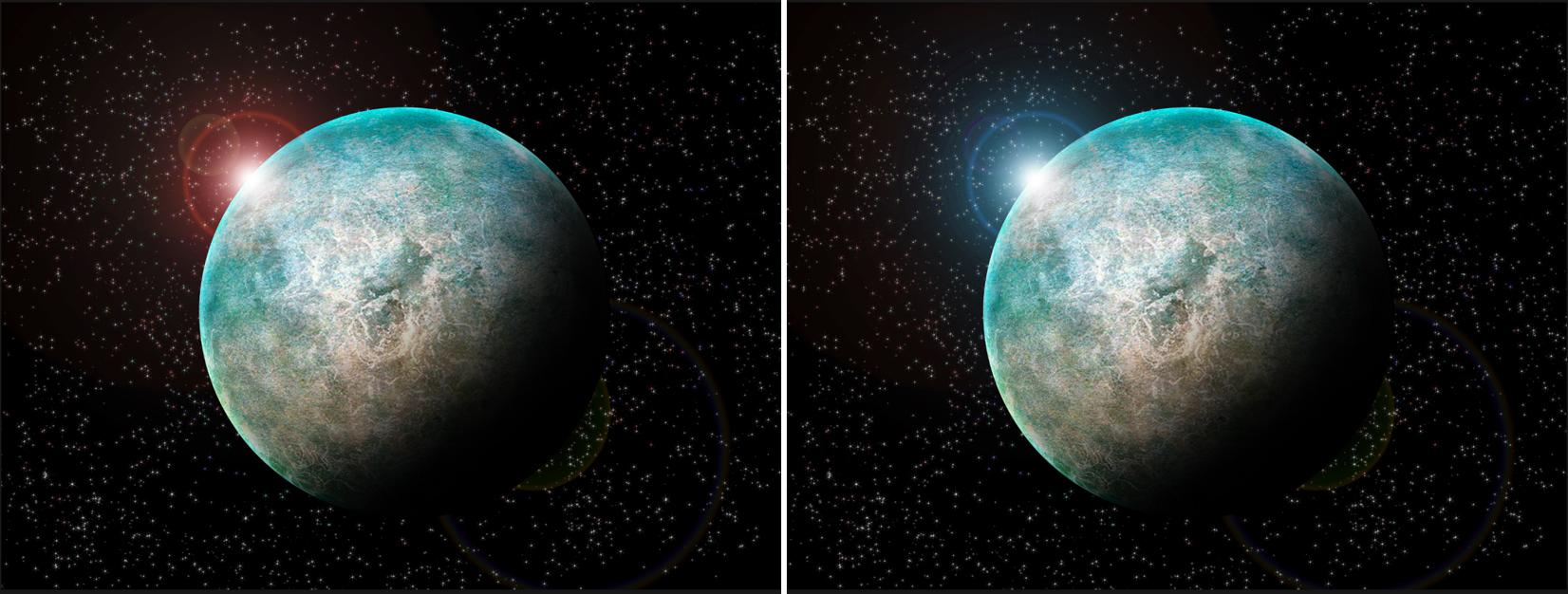
There is not much difference indeed, “just” the colour of the star… Yet it contains a lot of information by this little change. Assuming the host star is a main-sequence star, on the left side with the red star, I can tell it is a M-dwarf, a little and cold star emitting mainly in the red part of the spectrum. On the right side on the contrary it is either an O or B star, a very massive, big, bright and hot star. Given the exoplanet is the same on both side, this indicates that on the right side, the exoplanet must be way further away from its star than on the left. Actually, if the information given by the article with this artist’s impression indicates the size of the exoplanet, let’s take the size of Earth for example, you can even estimate roughly the distance by comparing the size of the planet and the star and thus estimate also the surface temperature.
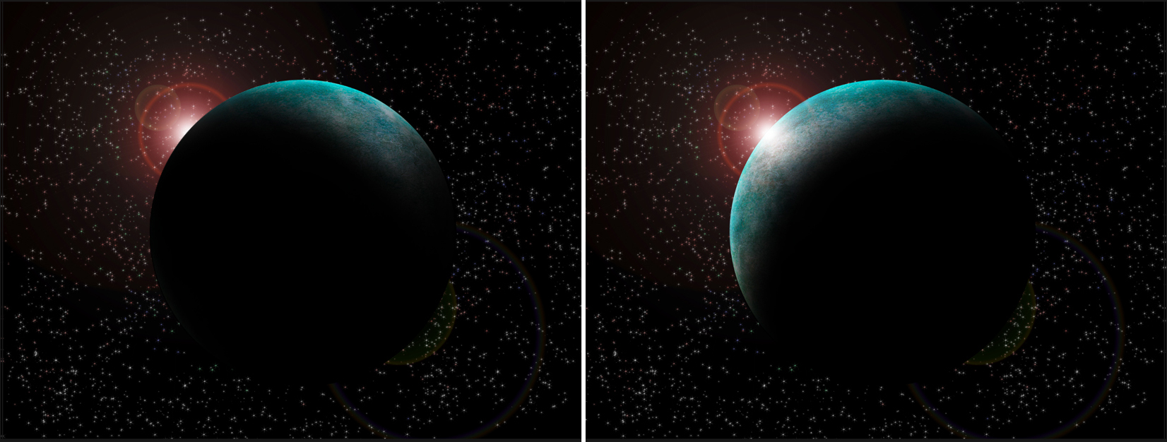
4) They sparkle the imagination and thus the interest of the public… And this is where comes a paradox with my previous point. To trigger an emotional response from the viewer, an artist’s impression might sometimes have to free itself from some physical aspects. If I take again the previous example, given the position of the star, the shadow is not correct on the previous image, and even less on the left side below, it should in truth, be more like on the right side below. However, in my opinion, the image above is more interesting artistically and has more personality and emotion carried with it than the right side below (as a stand-alone picture).
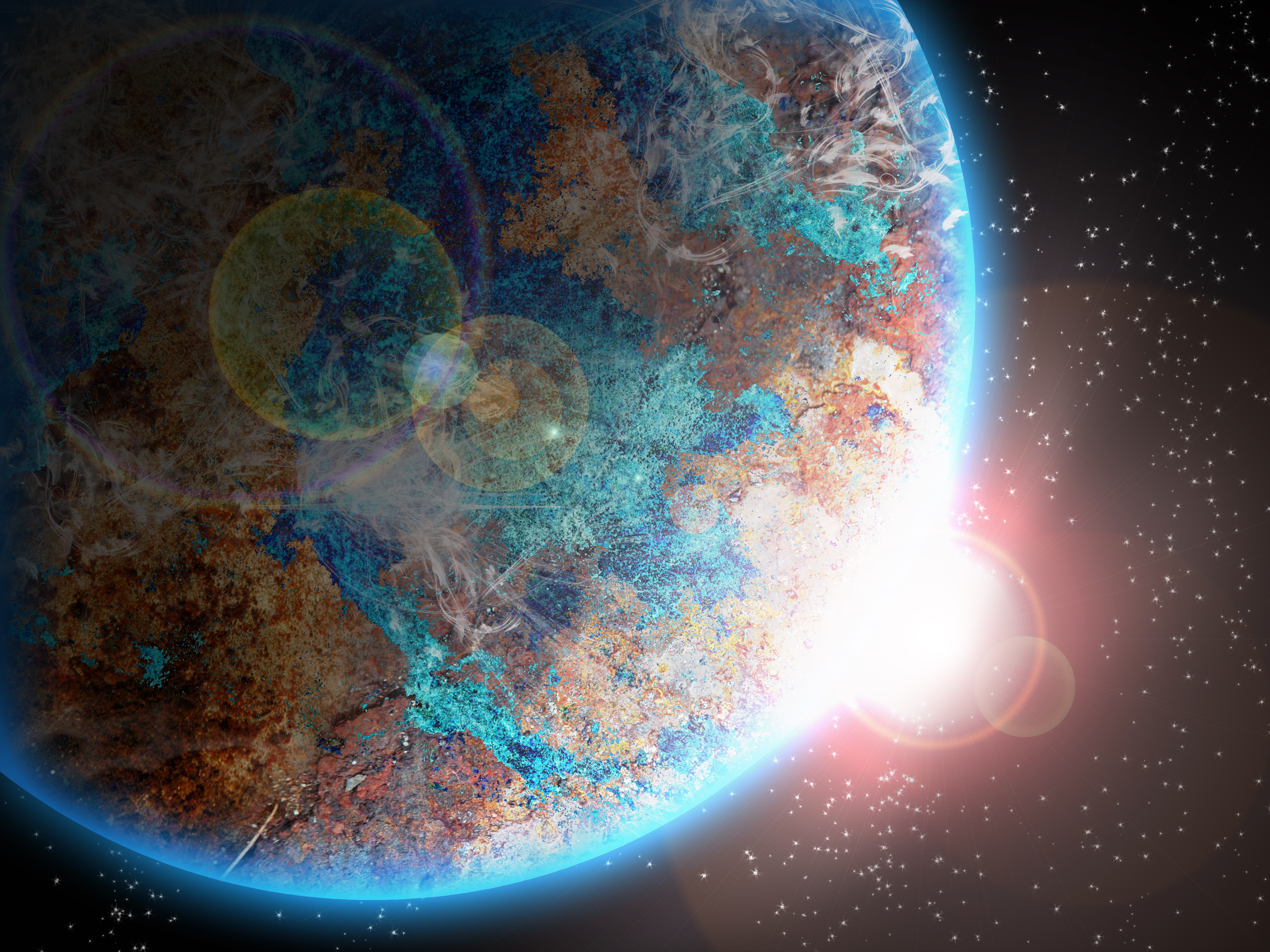
In the end, making an artistic view is an exercise where you have to balance between the knowledge you have of what you want to represent, and some artistic liberties you can afford to take to get a more interesting and attractive result. As a matter of fact, given we usually have relatively little information regarding the exoplanets we represent, we can take those liberties in what is not known yet about them. For example, I could have decided to get a surface filled with impact craters in my artistic view, or an enclosed-ocean in the center or to display a giant storm near the night side… As we don’t have this information, none would be wrong as they could both be physically possible.
Tutorial: how to create a planet?
Now that we have seen what artist’s impressions are, and what is important about them, let’s make one! For that, you will need an image editing software. I am gonna show you how to do that using the Adobe Creative suite (Photoshop in this case), but the principle stay the same with other software like GIMP, a free alternative. Please note that the keyboard shortcuts provided are for Photoshop, respectively on Mac and Windows.
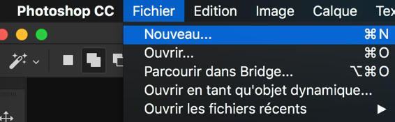
- Open a new document (cmd+N or ctrl+N) with the size you want. I tend to favour a 4/3 or 16/9 landscape format personally.
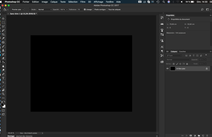
- Paint the background in black for the base.
- We will now create our background, full of stars. One solution is to copy and paste directly the picture of a field of view full of stars. A quick search on internet will provide you with many pictures. Alternatively, we can paint our background. However, obtaining a proper realistic star field would deserve its own tutorial, I will only show you a basic method. For that:
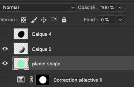
- Create a new layer (cmd+shift+N or ctrl+shift+N) or this symbol
 under the layer interface.
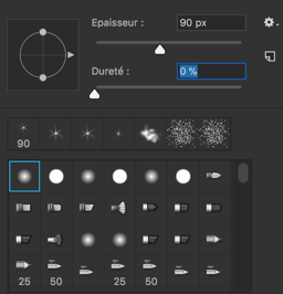
 - Select the white colour and the paint brush, we will have to play with the brush to get the effect we want, go in brush properties.
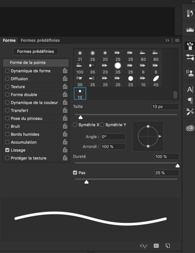
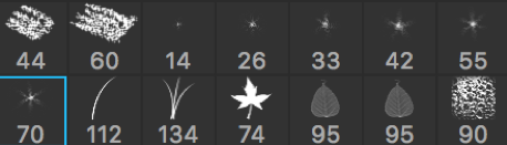
- In “shape of the brush” (forme de la pointe) select a brush looking like a star. In this exemple, the ones with numbers 14, 26, 33, 42, 55 and 70 under them.
- Increase the step (pas) until the preview of the brush is not a single line anymore.
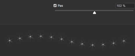
- Select “Shape dynamics” (Dynamique de forme) and increase the size variation (variation de taille) to 100%, this will create random sized stars.
- Select “Diffusion” and in it, select “both axes” (les deux axes). Increase the diffusion to spread the points. Increase “number” to get more stars and increase “Numerical variation” (variation numérique) to get random variation of the spatial concentration and thus look more realistic. The preview of the brush should now look like that, instead of a single line:
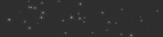
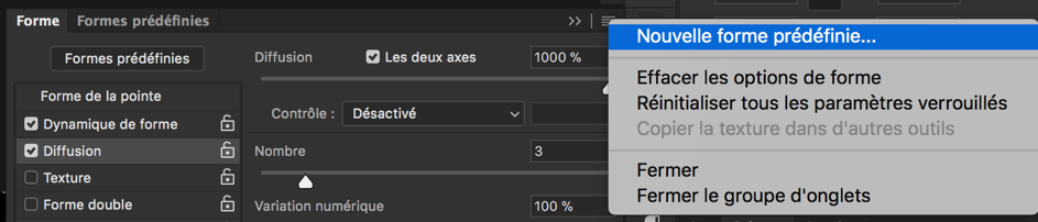
- Test the brush and play with the various parameters (size of the brush, step, size variation, etc.) until you are satisfied. Note that you can save your brush parameters to avoid doing that part again in the future.
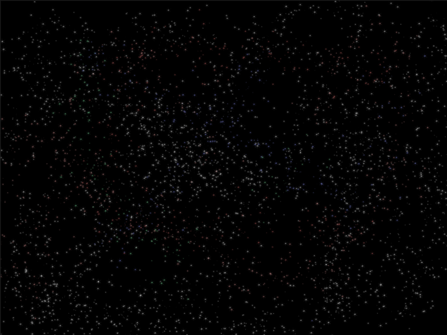
- You can now fill the void space with stars. You can eventually play with light colours to add red/blue shifted stars, and concentrate stars in some parts to make some clusters, galaxies or a Milky Way effect.
- Create a new layer (cmd+shift+N or ctrl+shift+N) or this symbol
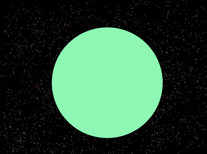
- Create a new layer and use the circular selection tool to create a circle (hold shift while tracing to stay circular). This will be the base shape for our planet. Fill the circle with some colour (doesn’t matter which).
- Now will be the most decisive step in the creation of our exoplanet and you may need to try a few times before to be satisfied (but with experience you’ll need less tries). We will prepare the topography or our planet and some of it’s surface features. Best strategy depends the type of planet you want: rocky, gaseous, etc.
- For gaseous planets…
- Create a new layer (cmd+shift+N or ctrl+shift+N)
- Select two colours slightly different for foreground and background, they will be the base colours of our gaseous planet. Here I selected colours similar to Jupiter and Saturn.

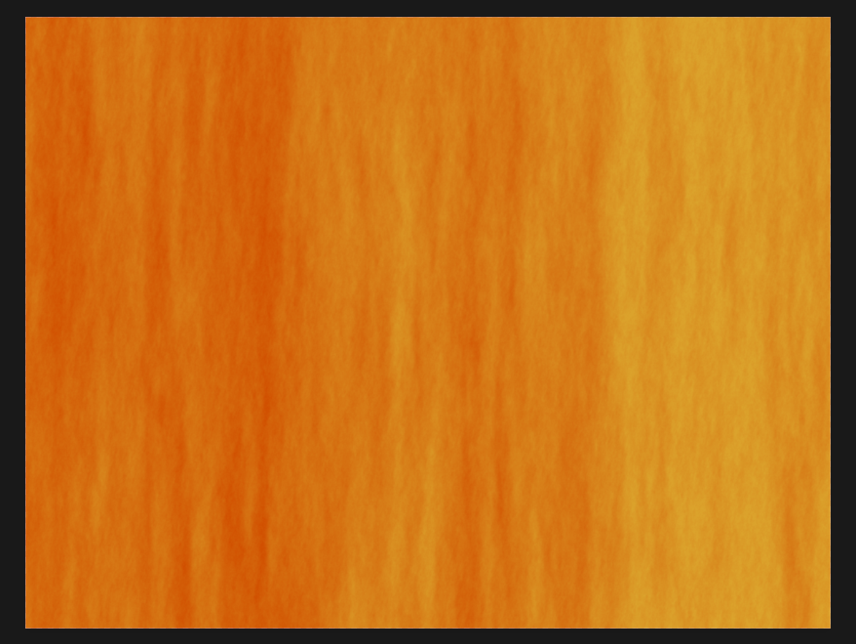
- Go in the menu to “Filters” -> “Render” -> “Fibres”. I advice a low variance and intensity. You can use the random button to generate a different render. This will fill the layer with some alternation of our two selected colours. You should obtain a texture like the following.
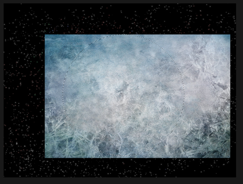
- For rocky planets, you will need a texture picture of very good quality, either found online or taken by yourself with a good camera. What work usually the best is to use something natural, like ice, mud or even concrete. Rust, dirty places and more generally textures containing some colour variations are the more interesting. Once you have selected one, copy and paste it in photoshop.
- For gaseous planets…
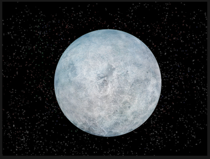
- Resize and rotate your texture (cmd+T or ctrl+T) so it fills at least all of the circle for our planet (it can be bigger). The rotation enables you to positions some surface elements where you want for rocky planets and determine the axis of rotation of your gaseous planet (the rotation axis will be perpendicular to the stripes). So it is important you already think to the position of your host star to get a rough idea where the shadows will be.
- Select the planet circle of step 4 (cmd/ctrl + click on the layer containing it). And then click on the texture layer to make it the active one.
- Go to “Filter” -> “Distort” -> “Spherize”

- Apply it with 100%, and the area selected will get rounder. This step helps give a bit more volume.
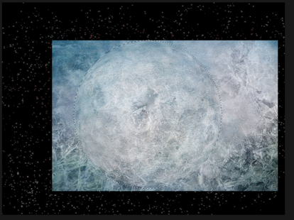
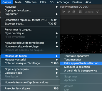
- Go to “Layer” (Calque) -> Layer mask -> “Reveal selection” (Faire apparaître la sélection). This will make invisible all that is not in the circle.
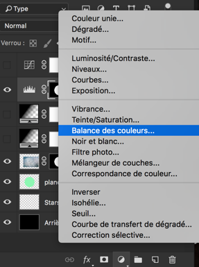
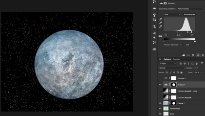
- Below the layer list, you can use the following icon to add layers to play with the colours of the planets. You have many possibilities here. Just select the planet shape before so they apply only to the planet and not the background. Those steps are not mandatory and are just to adapt your exoplanets to your taste/will.
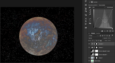
- Example of “levels” (niveaux) : change the contrast.
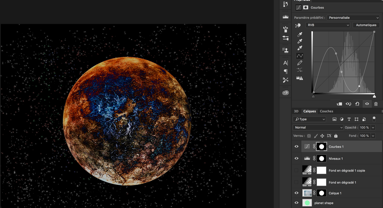
- Examples of “curve” (courbe).

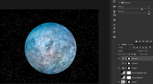
- Example of “vibrance”.
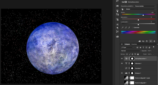
- Example of “hue/saturation” (teinte/saturation). Easiest way to change colours but might not be best looking, you can apply on all colours at the same time or only specific ones.
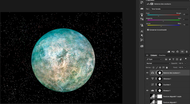
- Example of “colour balance” : by playing on light, dark and mediums, you can get nice results for differentiate various zones of the planet.
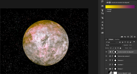
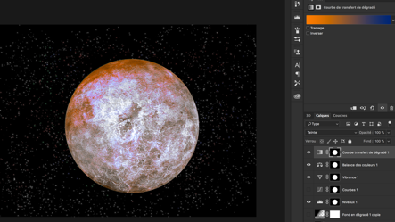
- Example of “gradient map” (courbe de transfert de dégradés), more complicated to use, you also need to change the mode of the layer at the same time (“Hue” here) I would recommend only if you are experienced.
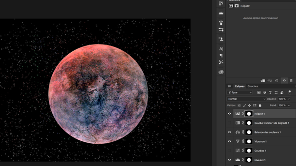
- Example of “invert” (négatif). Can be useful depending on your starting layer.
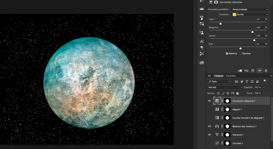
- Example of “selective colour” This one is really nice as you can play on each colour separately, I was able to reinforce a bit the brownish colour this way in our example.
- Example of “levels” (niveaux) : change the contrast.
- In the end, I selected in this example only my “levels”, “vibrance” and “colour balance” layers to get the colour I wanted. Comparison before/after all three layers.
- Create a new layer (cmd+shift+N or ctrl+shift+N), and select black colour + the following brush:
- Select the planet shape like in step 7. We will now do the shadow on the planet, do it accordingly to the position intended for your light source. You can eventually do that in multiple layers and play with the opacity of some shadow layers to reveal a bit more the surface and make the planet more appealing.
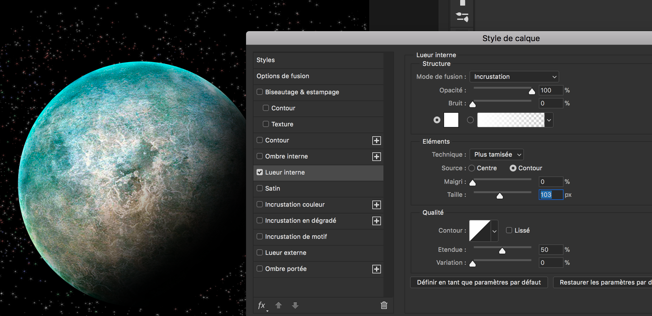
- Put the shape layer on top of all the others, except the shadow one(s). And put its “fill content” (fond) to 0%. The difference with opacity is that the effect we will now add will still appear, while they would not if opacity was at 0%.
- We will now add so lighter tones on the day side to get a better spherical aspect. Double click on the shape layer and add a “inner glow” (lueur interne). Set it to “overlay” (incrustation) instead of normal, and select the white plain colour, plus play with “size” to get what you prefer.
- For gaseous planets, or if you want to add an atmosphere glow for the rocky ones, you can duplicate the previous layer and changer the inner glow effect back to normal mode, and select a colour (vary the opacity and size to obtain the best). In addition you will need an outer glow effect of the same colour. The best looking option regarding the colour is to chose one dominating on the planet.
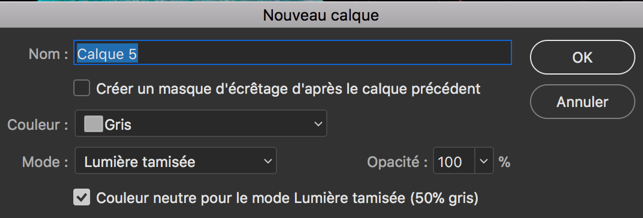
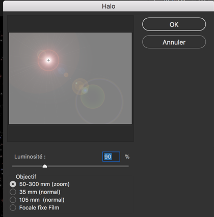
- Finally we will add a parent star (this is a very easy way to do, with the drawback it must be further away than the planet. More complicated ways with other render would need a proper tutorial). Create a new layer (cmd+shift+N or ctrl+shift+N) and select colour grey, mode “ hard light” (lumière crue) and select the box “neutral colour for the hard light mode (50% grey).
- Go to Filters, Render -> Lens Flare (halo).
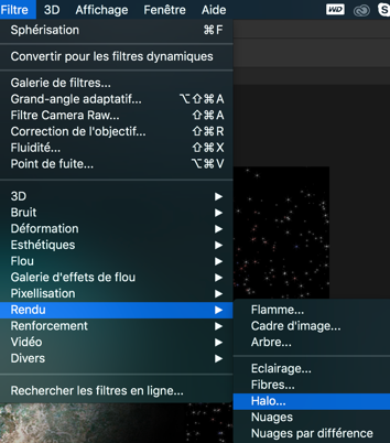
- Move the source to match the planet side for example or the position you want, and select the type of lens flare you like the most, and you have your star! It might take a couple of try to adjust the position if not good the first time when clicking ok. If so, just cancel (cmd+Z or ctrl+Z) and redo it.
Congratulations, you have created a very nice looking exoplanet!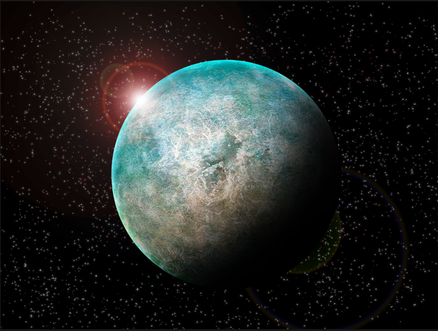
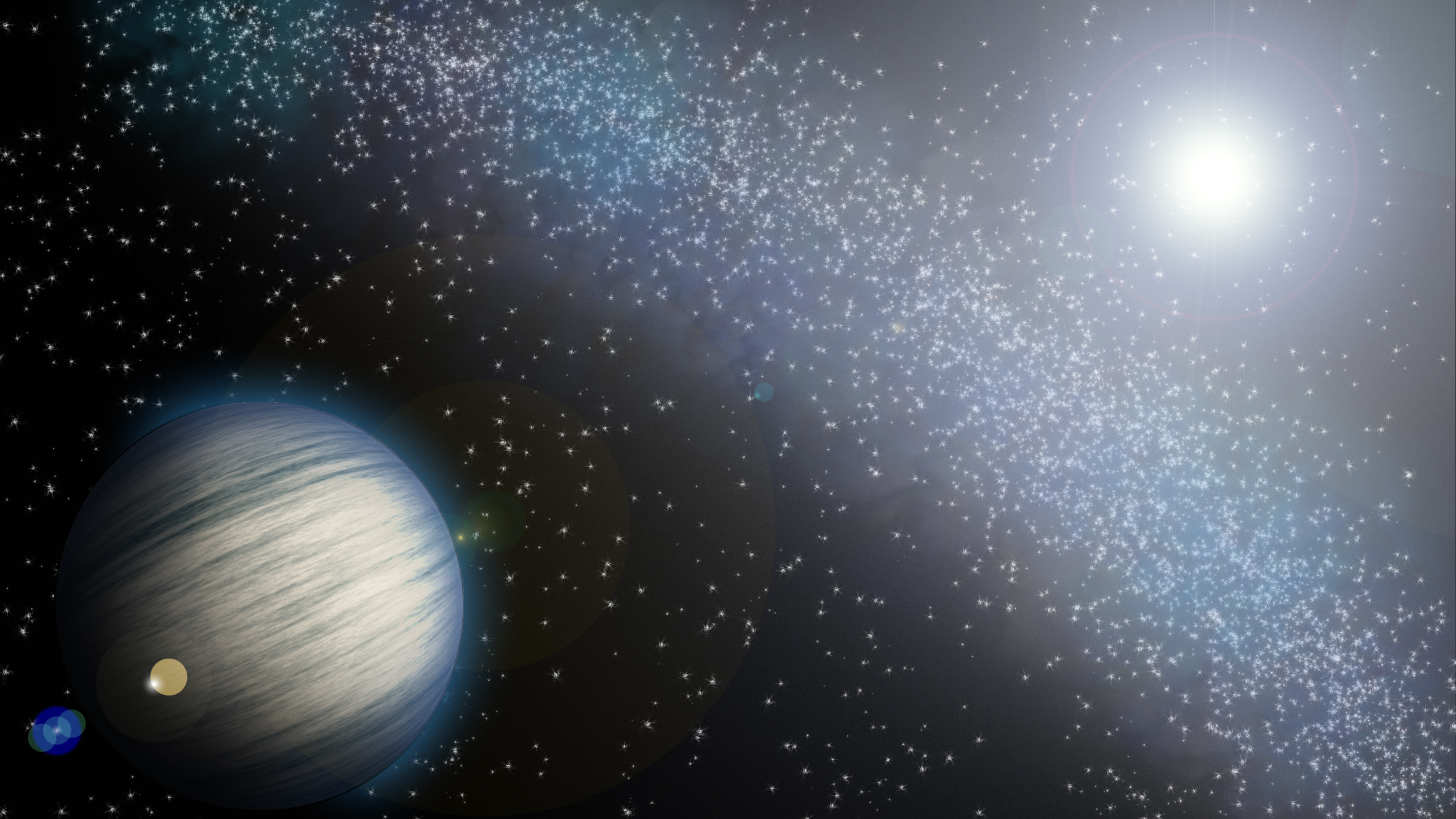
Now, this should give you the base necessary to make your own exoplanets, you can experiment and try variations of this tutorial to obtain some results a bit different. To finish, here is a gallery of few others made that way. If you try this tutorial, don’t hesitate to share your results with us on Facebook!
Categories: External Newsletter